We’re relentlessly searching for talented and inspiring people to work with. If you’d like to help us make a difference that matters, please get in touch.
Link for United Kingdom

United Kingdom

19:22
We are excited to begin a new chapter in the heart of London. We look forward to welcoming you at our new offices in Paddington.
Link for Netherlands

Netherlands

20:22
Our offices are located in the Amsterdam-Zuidoost district. This vibrant area is also home to the Johan Cruijff Arena and the stadium of Ajax Football Club.
Link for United States

United States

14:22
With our talent spread from East to West coasts, 1HQ United States is home to some of brightest strategic and creative minds in North America.
Link for Singapore

Singapore

02:22
Our offices are located on Anson Road in the heart of Singapore's Central Business District. This dynamic area is a key hub in our city-state.

What was the challenge?

Nature’s Heart is proud to be a family business, run by three brothers in South America who inherited a vegetable-drying business from their father.

The brothers recognised the huge potential of the sweet and nutritious goldenberry grown in their native land and sought to share it with the world. Adding to the universal appeal of the brand, their Goldenberry Plan is a responsible sourcing programme that helps improve livelihoods for the thousands of farmers in Ecuador and Colombia they partner with.

Nature’s Heart wanted to begin their global expansion in Europe and, in particular, the UK. Following qualitative research, they found that the existing visual identity would not be doing them any favours in these new markets.
What was our thinking?

1HQ were invited to develop a new visual identity and the first step on the journey was to immerse our team of strategists and designers in the Nature’s Heart brand.

We did this firstly through a retail safari that allowed us to explore the broad landscape of healthy, purpose-led brands. This took us to an eclectic mix of health food cafés and retailers, ethical clothing shops and cosmetic stores.

We then ran a UK category audit, before deep diving into a semiotic analysis of the cultural language, signs, codes and symbols that drive appeal in the category.

Our collective insights provided us with a favoured territory that reflected the brand’s strong sense of purpose: ‘Nature’s Heart, making food that makes a difference’.

What did we do?

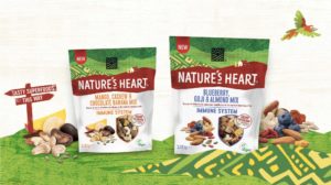
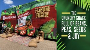
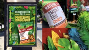
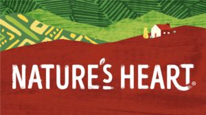
Our new visual identity represents the brand’s Latin American heritage through the use of pattern, texture and colour, with an Andean farmhouse nestled in the layers of the land to reflect the brand’s roots.

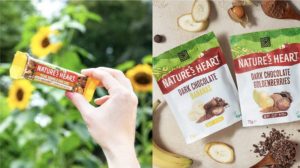
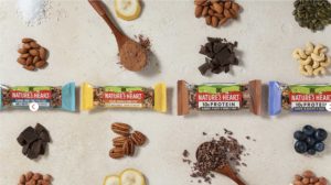
We complemented this design with a new style of photography that depicts the products and ingredients more realistically, adding to the appetite appeal.

With the visual identity approved, we set about building a new following in Europe with a communications campaign across both static and digital out of home and social media.

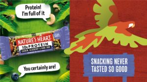
The respect Nature’s Heart has for its ingredients led us to the idea of making them the heroes of the campaign. We anthropomorphised each of the prominent ingredients with witty one liners that brought to life the brand’s spirited personality.

What did we achieve?

Our endeavours were certainly fruitful.

Following the redesign and campaign launch, Nature’s Heart have seen a 340% increase in sales with 13 new retailers added to the list of stockists. We’ve also had incredible feedback from consumers through social channels and great excitement from the team managing lead accounts in the US market. We look forward to watching the brand continue to flourish in the UK and beyond!

Surprise Me

Surprise Me

Surprise Me

Surprise Me

Surprise Me

Surprise Me

Surprise Me

Surprise Me

Surprise Me

Surprise Me

Surprise Me

Surprise Me

Surprise Me

Surprise Me

Surprise Me

Surprise Me

Surprise Me

Surprise Me

Surprise Me

Surprise Me

Surprise Me

Surprise Me

Surprise Me

Surprise Me

Preparing