We’re relentlessly searching for talented and inspiring people to work with. If you’d like to help us make a difference that matters, please get in touch.
Link for United Kingdom

United Kingdom

06:07
From our brewery in the heart of Windsor, we’ve been bringing brands to life for over three decades.
Link for Netherlands

Netherlands

07:07
Overlooking a charming canal (where doesn't in downtown Amsterdam?), our offices are a mere stone’s throw from the iconic Rijksmuseum.
Link for United States

United States

02:07
With our talent spread from East to West coasts, 1HQ United States is home to some of brightest strategic and creative minds in North America.
Link for Singapore

Singapore

14:07
Close to the action and the water of Marina Bay, our office is based in the very heart of this culturally diverse and vibrant city-state.

What was the challenge?

The good folk at ManiLife have one job and one job only: creating the tastiest peanut butter on the planet.

As they were pretty incredible at it, the brand had steadily grown exponentially through distribution gains.

However, the market was changing. The main competitors had moved into glass jars which gave them the opportunity to make their brands more premium. They were starting to steal Manilife’s lunch (not to mention breakfast). This was a serious blow to their ambitions of establishing listings in more of the leading supermarkets.

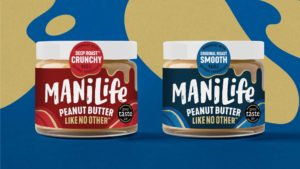
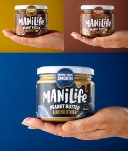
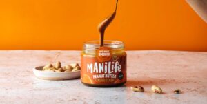
Manilife quickly made the decision to follow suit and move into glass too. They then approached 1HQ to re-energise the brand’s look and feel to optimise the new jar’s launch.
What was our thinking?

The move to glass was critical, providing ManiLife with the opportunity to drive premium cues and justify their price point.

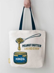
The brand already had a vibrant stand-out character, and the marketing team didn’t want us to reinvent the wheel; just dial up the energy and find new ways to bring the brand to life off-pack too.

What did we do?

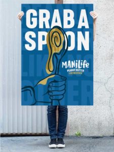
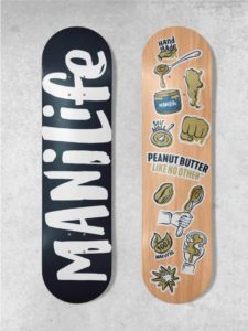
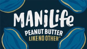
Our design team evolved the hand-drawn logotype to inspire this exciting new world for ManiLife.

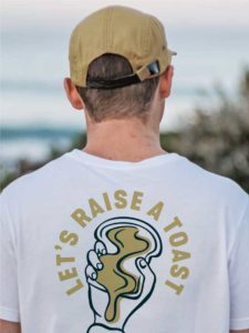
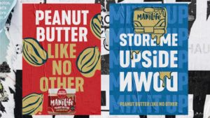
Bespoke illustrations echoing the handmade product and our hand-drawn logo brought fresh excitement and edge to the brand. A new suite of assets was introduced across all touchpoints and channels, helping to make our peanut butter feel even more distinctive.

What did we achieve?

By turning the brand on its head, we gave ManiLife its mojo back.

The new orientation even delivered a new USP – less time stirring, more time enjoying!

With our client’s support, we helped to prove that this was, indeed, a peanut butter like no other. That’s why you’ll see the product on the shelves of more leading supermarkets in the coming year.

Surprise Me

Surprise Me

Surprise Me

Surprise Me

Surprise Me

Surprise Me

Surprise Me

Surprise Me

Surprise Me

Surprise Me

Surprise Me

Surprise Me

Surprise Me

Surprise Me

Surprise Me

Surprise Me

Surprise Me

Surprise Me

Surprise Me

Surprise Me

Surprise Me

Surprise Me

Surprise Me

Surprise Me

Preparing