We’re relentlessly searching for talented and inspiring people to work with. If you’d like to help us make a difference that matters, please get in touch.
Link for United Kingdom

United Kingdom

21:12
From our brewery in the heart of Windsor, we’ve been bringing brands to life for over three decades.
Link for Netherlands

Netherlands

22:12
Overlooking a charming canal (where doesn't in downtown Amsterdam?), our offices are a mere stone’s throw from the iconic Rijksmuseum.
Link for United States

United States

16:12
With our talent spread from East to West coasts, 1HQ United States is home to some of brightest strategic and creative minds in North America.
Link for Singapore

Singapore

04:12
Close to the action and the water of Marina Bay, our office is based in the very heart of this culturally diverse and vibrant city-state.

What was the challenge?

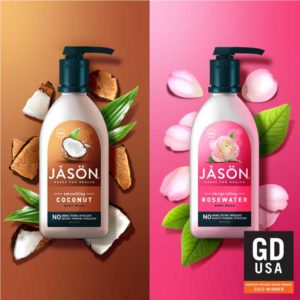
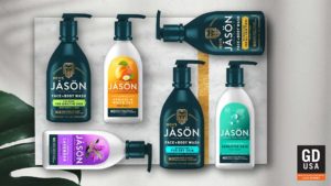
Starting to look a little tired in the marketplace, the JASON personal care portfolio needed a makeover. 1HQ got the call and we were asked to redesign their product packaging across all segments.

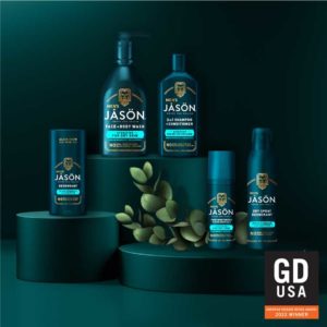
The aim was to help JASON regain its status as a leader in the Natural’s category and pave the way for the launch of their new sub-brand, the JASON MEN’s collection.

As JASON is a well-known player in the Natural’s category, we knew all eyes would be on us and we’d only have one chance to get it right.
What was our thinking?

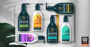
1HQ rooted the new design in a positioning that was linked to the brand’s Greek origins, and the simplicity of the natural ingredients as healing remedies.

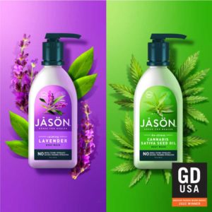
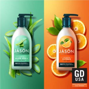
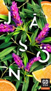
JASON is known and loved for bold pack colours and the beneficial natural ingredients, such as aloe or lavender. This became the cornerstone for our design development.

What did we do?

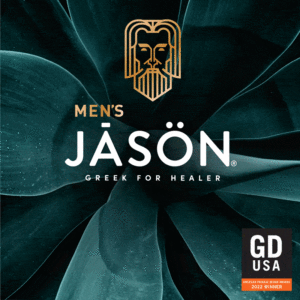
Introducing Greek for Healer as the new tagline, and locking it up with the logo, provided a firm foundation that references both the brand’s historical roots and the product benefits. This was just the start of JASON’s reinvigoration.

We modernised the hair and body product ranges by freeing the brand name and transforming it into the focus on every pack. We also celebrated the natural fruit and botanical ingredients with a new simplified design that effectively put them on a pedestal.

Perhaps most striking of all, we introduced a bold new jade colour for the range. Grabbing attention on shelf, powerful jade is the primary shade for our MEN’S line and is used across the entire portfolio to tie everything together.

For the MEN’S range, each pack is adorned with eye-catching, crafted, metallic gold details, highlighting an illustration of our mythical healer.

What did we achieve?

JASON was back. With a cohesive look for the brand across all segments, plus a new Men’s range with outstanding stand-out in a crowded marketplace. Initial testing with our target audience was emphatically positive. The feedback from our delighted client was equally so.

Surprise Me

Surprise Me

Surprise Me

Surprise Me

Surprise Me

Surprise Me

Surprise Me

Surprise Me

Surprise Me

Surprise Me

Surprise Me

Surprise Me

Surprise Me

Surprise Me

Surprise Me

Surprise Me

Surprise Me

Surprise Me

Surprise Me

Surprise Me

Surprise Me

Surprise Me

Surprise Me

Surprise Me

Preparing