We’re relentlessly searching for talented and inspiring people to work with. If you’d like to help us make a difference that matters, please get in touch.
Link for United Kingdom

United Kingdom

06:49
From our brewery in the heart of Windsor, we’ve been bringing brands to life for over three decades.
Link for Netherlands

Netherlands

07:49
Overlooking a charming canal (where doesn't in downtown Amsterdam?), our offices are a mere stone’s throw from the iconic Rijksmuseum.
Link for United States

United States

01:49
With our talent spread from East to West coasts, 1HQ United States is home to some of brightest strategic and creative minds in North America.
Link for Singapore

Singapore

13:49
Close to the action and the water of Marina Bay, our office is based in the very heart of this culturally diverse and vibrant city-state.

What was the challenge?

Not only is sportswear one of the most competitive sectors in the retail market, it’s also full of some of the most successful brands on the planet. So how do you launch a new brand successfully into this market and give it real standout?

Inspired by the herculean nature of the challenge, we jumped at the chance to help. We needed to make this new active sportswear for women brand feel fresh and surprising but, at the same time, comfortable and supportive, just like the new attire.
What was our thinking?

We began the process with brainstorming sessions to pinpoint some meaningful differences.

Our client, who took part in the sessions, is a professional athlete who wanted the design output to be uncomplicated, evoking both strength and speed.

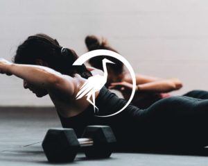
After much deliberation, we took our inspiration from nature. The crane is a truly impressive creature; strong, graceful, beautiful and devoted. The perfect symbol for a sportwear brand for women.

What did we do?

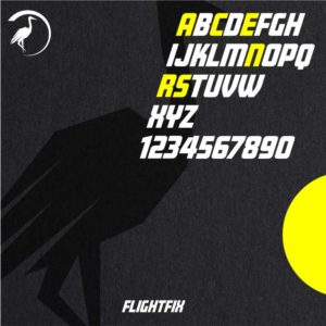
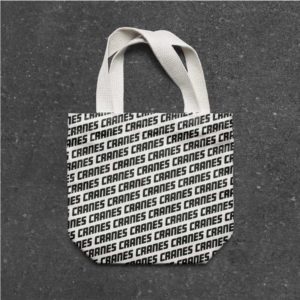
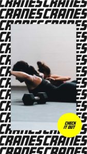
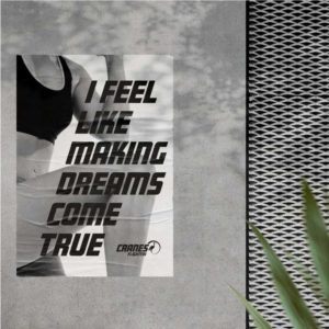
Going forward, we explored ‘forward-leaning’ typography, with a minimal, modern structure, paired with bold photography, mostly in black and white. From there, we created the striking brand identity that met all the expectations of our client.

Japanese art perfectly embodies the striking balance between aesthetics and grace that we wanted to capture. Our crane illustration followed the Japanese style for purity and elegance, reflecting the qualities of the bird we had chosen to champion the brand.

A carefully edited colour-palette was also created to facilitate the transition from brand mark to embroidered stamps. Our selections encapsulated the essence of the brand without obvious gender cues.

What did we achieve?

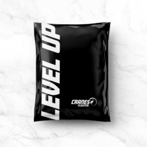
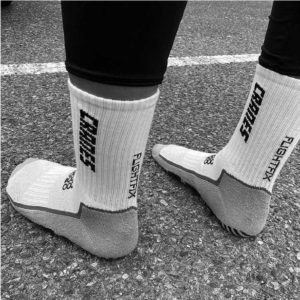
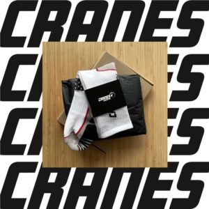
Together, we created a brand with dynamism and energy that could easily be rolled out to any application from digital assets to sports socks. Right from the get-go, the crane was flying!

“Working with 1HQ was a new experience to me. As this new brand is very close to my heart, my past in sports, as well as my future in business, I believe the team helped me complete a vision. They listened to my ideas and brought their own thoughts to the table.”
Laura Kaminski
Cranes Athlete

Surprise Me

Surprise Me

Surprise Me

Surprise Me

Surprise Me

Surprise Me

Surprise Me

Surprise Me

Surprise Me

Surprise Me

Surprise Me

Surprise Me

Surprise Me

Surprise Me

Surprise Me

Surprise Me

Surprise Me

Surprise Me

Surprise Me

Surprise Me

Surprise Me

Surprise Me

Surprise Me

Surprise Me

Preparing