We’re relentlessly searching for talented and inspiring people to work with. If you’d like to help us make a difference that matters, please get in touch.
Link for United Kingdom

United Kingdom

12:42
From our brewery in the heart of Windsor, we’ve been bringing brands to life for over three decades.
Link for Netherlands

Netherlands

13:42
Overlooking a charming canal (where doesn't in downtown Amsterdam?), our offices are a mere stone’s throw from the iconic Rijksmuseum.
Link for United States

United States

07:42
With our talent spread from East to West coasts, 1HQ United States is home to some of brightest strategic and creative minds in North America.
Link for Singapore

Singapore

19:42
Close to the action and the water of Marina Bay, our office is based in the very heart of this culturally diverse and vibrant city-state.

What was the challenge?

'Original' is a word that’s often thrown around by marketers too easily. But not in this case. Two Lasses was the first ever British-made rum created by two Yorkshire women.

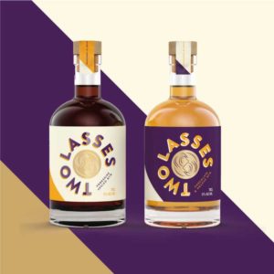
1HQ jumped at the chance to collaborate with this unique start-up and partner with the two co-owners who shared a strong and distinct vision. We were tasked with creating a series of elegant and dynamic bottle labels for their range of rum and liqueur variants.

What was our thinking?

Two Lasses needed to thrive in a largely ‘masculine’ category.

To enable us to make our mark, we agreed with the client to focus on the three ‘F’s: Flair, Fun and Feminine energy to build the brand.

The brief was clear and direct; to create a brand that stands out and celebrates women, with a modern and contemporary visual expression. The design team immersed themselves in the psychology of our (mainly) female target audience before starting work on the labels.

What did we do?

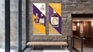
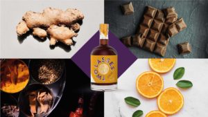
1HQ created a striking yet uncomplicated visual identity.

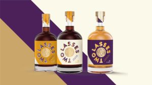
This was crafted into a dynamic, geometry and symmetry-led look and feel with a flair for lavish colours and modernity. Celebrating the bold personalities of our two founders, our designs put them right at the heart of the brand.

Confident and flavour-relevant colour combinations, and the bold use of space, directed consumers to the gold-foiled brand mark representing the lasses themselves.

On the back of bottle, the story continues to unfold with tasting notes and suggested ways to enjoy the beverage. The typography is minimalistic, yet the use of two carefully chosen fonts – one serif and one sans serif – promotes the brand’s duality.

The difference between the two rums and the two liqueurs is established in a simple yet effective way: the colours are reversed between the two similarly-flavoured products to create clear distinction between them, yet linking them to each other.
What did we achieve?

The branding has attracted hugely positive feedback at every trade show our clients have attended; only recently winning the IWSC 2022 Bronze Medal, a Silver Medal for the London Spirit Competition and a Gold Medal for The Spirits Business Rum and Cachaca Masters 2022. 

People notice the bottles, pick them up and are intrigued to find out more. The Two Lasses have hit the ground running.

What did our client think?

“We gave 1HQ a rather tight deadline to design and create the branding and labels for our new spirits brand. The team worked quickly to offer various personalities that would both reflect our characters and position us well within a hugely competitive market. The team were supportive and always available to help, guide and advise us.”
Lindsey Harrison & Rebecca Allinson
Founders

Surprise Me

Surprise Me

Surprise Me

Surprise Me

Surprise Me

Surprise Me

Surprise Me

Surprise Me

Surprise Me

Surprise Me

Surprise Me

Surprise Me

Surprise Me

Surprise Me

Surprise Me

Surprise Me

Surprise Me

Surprise Me

Surprise Me

Surprise Me

Surprise Me

Surprise Me

Surprise Me

Surprise Me

Preparing