We’re relentlessly searching for talented and inspiring people to work with. If you’d like to help us make a difference that matters, please get in touch.
Link for United Kingdom

United Kingdom

10:57
From our brewery in the heart of Windsor, we’ve been bringing brands to life for over three decades.
Link for Netherlands

Netherlands

11:57
Overlooking a charming canal (where doesn't in downtown Amsterdam?), our offices are a mere stone’s throw from the iconic Rijksmuseum.
Link for United States

United States

05:57
With our talent spread from East to West coasts, 1HQ United States is home to some of brightest strategic and creative minds in North America.
Link for Singapore

Singapore

17:57
Close to the action and the water of Marina Bay, our office is based in the very heart of this culturally diverse and vibrant city-state.

What was the challenge?

Optibac is the No1 probiotics supplement in independent Health Food Shops and Pharmacies with sales of £14m in the UK alone.

With the category predicted to grow four times faster than the overall digestive health sector, competitors and retail private label ranges were quickly moving in to erode the brand’s leadership position.

With so many more products to choose from and new UK legislation forbidding the use of the word ‘probiotics’, customers didn’t know which way to turn. That prompted Optibac to commission 1HQ to conduct an all-embracing review of their brand and communication strategy, and to quickly put things right again.
What was our thinking?

To find out what was really going on in the market, we undertook an initial research review.

This identified that the brand lacked a clear positioning and value proposition. Consumers described Optibac as ‘bland’, ‘cold’ and ‘clinical’. What they wanted was a brand with empathy and natural wellbeing cues. We had some serious work to do.

What did we do?

Armed with this insight, we undertook a semiotic analysis of the gut health category to better understand the use of visual and verbal language.

(The client was also keen to reduce the amount of plastic in their packaging and so we also conducted a sustainability review.)

Our team discovered that people find this whole category difficult to understand. What we needed was a clear and motivating consumer benefit. Supported by brand imagery that demonstrated better use of colour, language and tonality to strike the right balance between product efficacy and personal wellbeing.

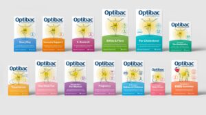
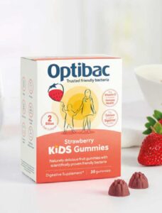
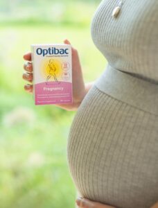
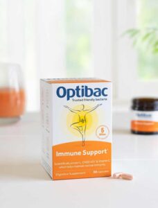
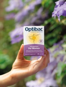
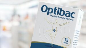
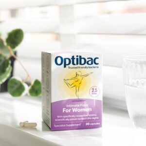
This led us to introduce the ‘yoga’ graphic, representing balance, and the yellow lines suggesting natural, healthy energy radiating from the gut.

What did we achieve?

Our new brand imagery researched fantastically well.

It was seen as both aspirational and motivating by the trade and consumers, alike. It was also preferred over the key competitors, leading to new listings in major multiples.

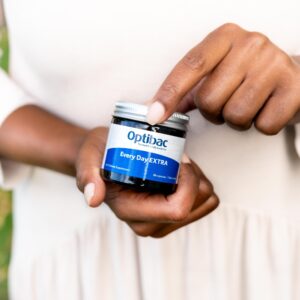
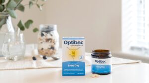
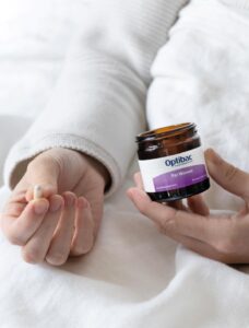
At the same time, plastic in the packaging was down by over 96% in selected product SKUs. The plastic tubs had been replaced by glass jars with a metal, embossed lid that helped preserve the live cultures inside.  Adding to the appeal, a bow-shaped card insert shared the intriguing brand story. Optibac had suddenly become an aspirational lifestyle brand.

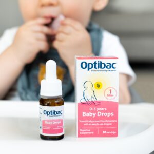
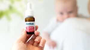
We didn’t stop there. A review of the range architecture has already led to a number of new product innovations with more in the pipeline.

Surprise Me

Surprise Me

Surprise Me

Surprise Me

Surprise Me

Surprise Me

Surprise Me

Surprise Me

Surprise Me

Surprise Me

Surprise Me

Surprise Me

Surprise Me

Surprise Me

Surprise Me

Surprise Me

Surprise Me

Surprise Me

Surprise Me

Surprise Me

Surprise Me

Surprise Me

Surprise Me

Surprise Me

Preparing