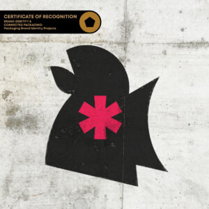
The new Mother Clucker visual style and brandmark embodies the brand’s daring, bold, obsessive personality, and outspoken attitude. The identity communicates a brand that is proud to shout from the rooftops, demonstrated through the megaphone inspired block and typography. The asterisk is a nod to the brand name’s play on words, censoring out the near expletive, and picks up on the original symbol found on the old ambulance. The colour palette leverages red as a key category code for chicken in the fast food/delivery space, with green also drawing on the army ambulance roots.
